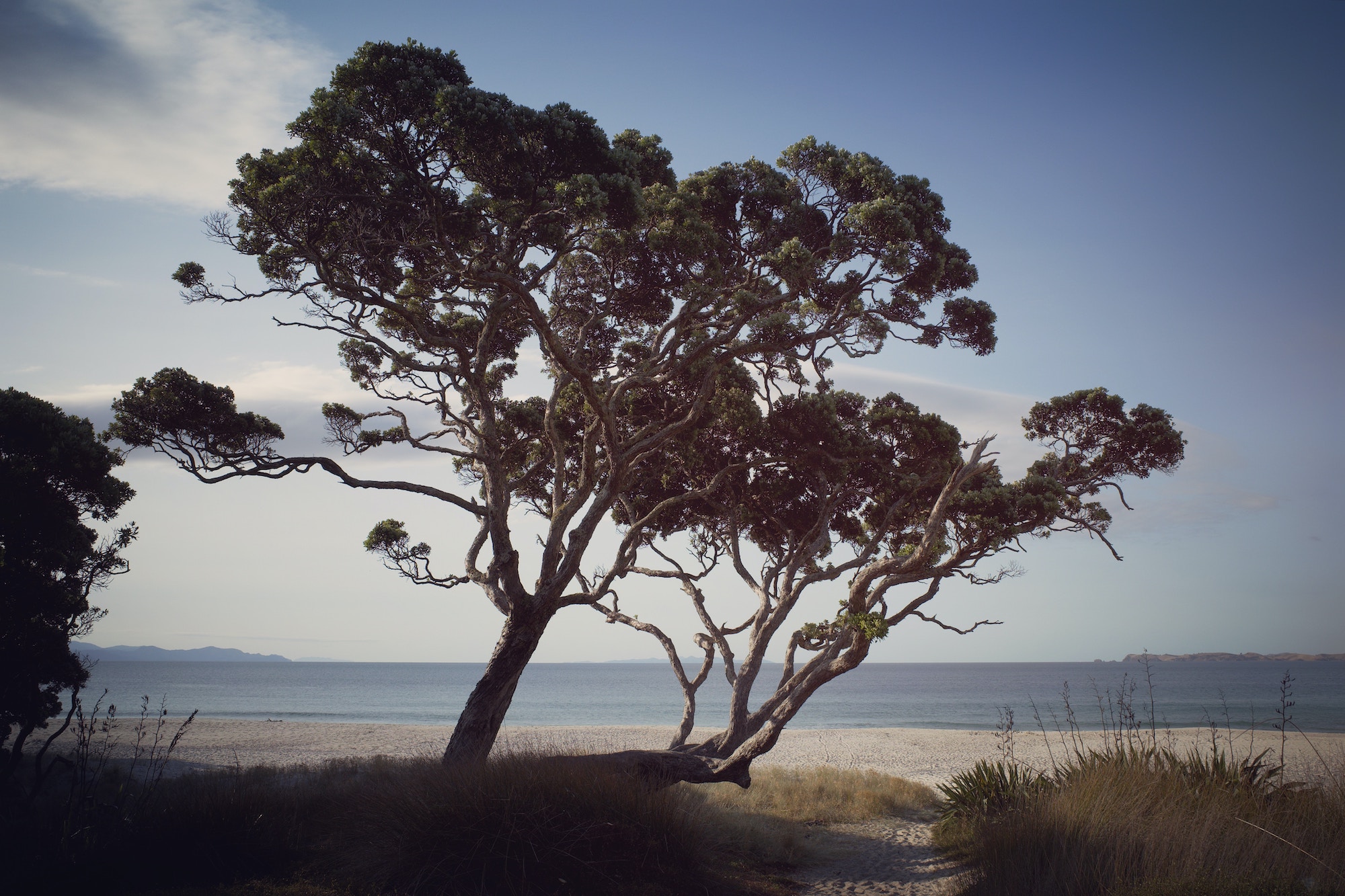
Responsive Images: Pōhutukawa tree example using image-set CSS
- One minute read - 101 words
A beautiful tree
Today I learned some about responsive images, and launched a practical demonstration to see the difference in action. If you visit this awesome website it will serve you a different image based on pixel density. This is done using the image-set property in CSS.
    body {
        /* https://drafts.csswg.org/css-images-4/#image-set-notation */
        /* fallback */
        background-image: url("static/img/opito-hero-med.jpg")
        background-image: image-set(
        url("static/img/opito-hero-med.jpg") 1x,
        url("static/img/opito-hero-lg.jpg") 2x
        );
        background-size: 100%;
    }