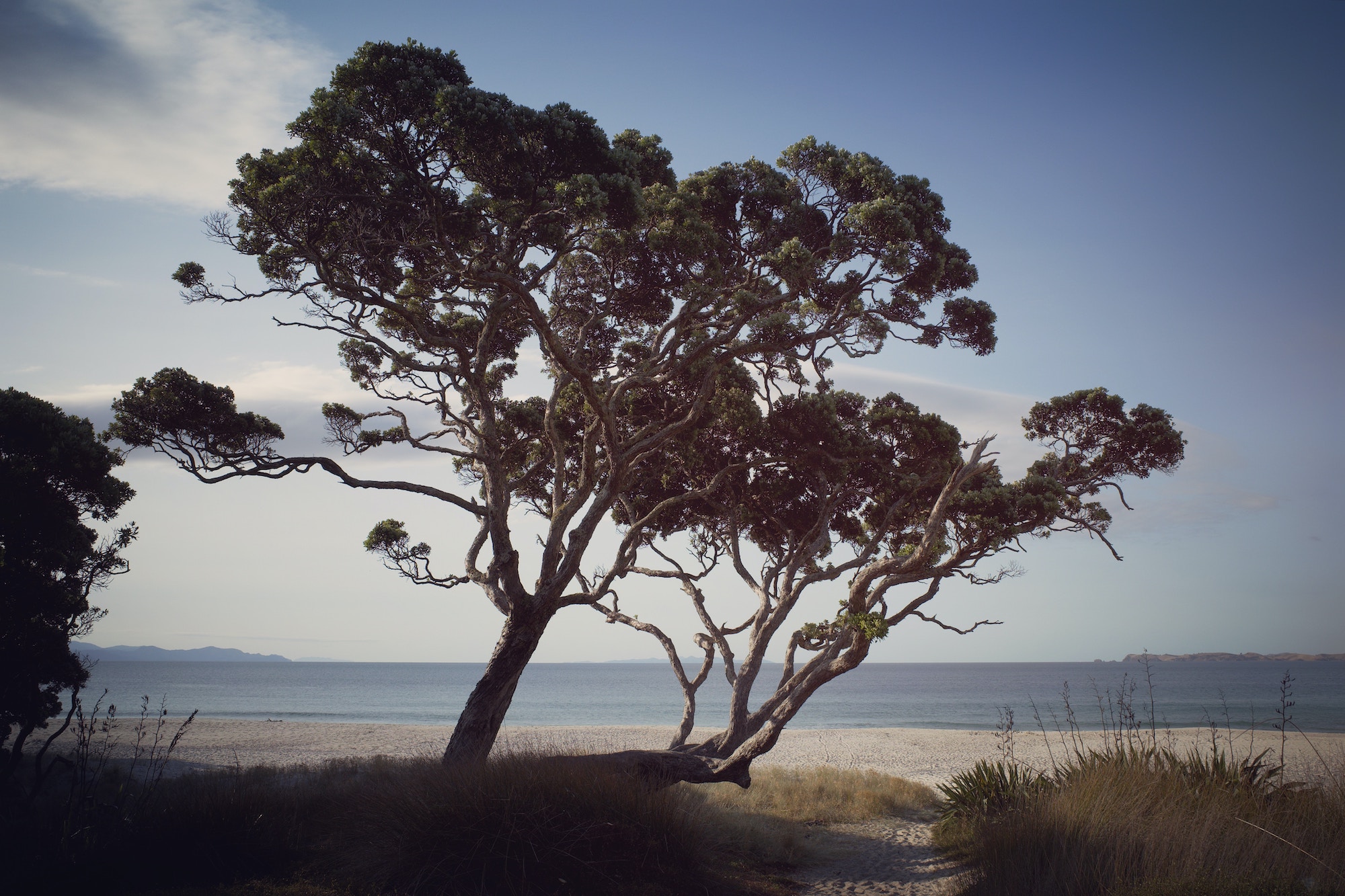
Responsive Images: Pōhutukawa tree example

A beautiful tree
I recently re-learned some about responsive images, and have a practical demonstration to see the difference in action. If you visit this awesome website on a mobile phone in portrait mode, it will serve you a smaller and a different cropped resource than if you view it on landscape. This is done using the srcset attribute on an img tag as well as the picture element for greater control.
See: Responsive Pōhutukawa deployed with Netlify
  <picture id="pohutukawa">
    <source srcset="img/opito-hero-sm.jpg 600w, img/opito-hero-med.jpg 1200w, img/opito-hero-lg.jpg 2400w, img/opito-hero.jpg 4800w"
    media="(orientation: landscape)"
    alt="Pōhutukawa tree in Opito Bay, New Zealand"
    sizes="100vw"
    title="Pōhutukawa tree in Opito Bay, New Zealand"
      />
    <img class="opito-hero" srcset="img/cropped-sm.jpg 600w, img/cropped.jpg 1200w" sizes="100vw"
    alt="Pōhutukawa tree in Opito Bay, New Zealand" loading="eager" decoding="sync"
    title="Pōhutukawa tree in Opito Bay, New Zealand"
    />
  </picture>
These two features allow for art direction as well as greater web performance.
And is it not a cool tree?
- Pōhutukawa
- New Zealand
- Aotearoa
- Responsive Images
- Srcset Attribute
- Picture Element
- Web Performance
- Performance