Return of CSS Outline
Morgan Murrah
An example input that has keyboard focus and has a nice blue outline around it with CSS:
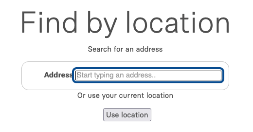
This is basically how it should be, and could look very differently in style, but it is important that it is there
Outlines around focused elements such as buttons and inputs are important for keyboard users and people with different vision levels to use your websites. Since 2022 there is little excuse against properly setting these up, but there is a history of issues with outlines on the web and not every resource explains the issue.
People who particularly rely on keyboard access and visual cues may not be able to see what is in focus without an outline. It may be uncomfortable, or not usable at all for some users if there is no focus indicator. I use my keyboard as a first preference and like to see the outline: it is a preference for me and a need for some.
It is also possible to have a hover style for example that applies an outline from a mouse or pointer hovering over an element and not receiving keyboard focus, for example this website has outlines on hover of some buttons intended it to make it easier to visually see.
Unfortunately, with a long history going back to 2008 or earlier, some developers and designers thought it was a good idea to set outline CSS to 0. Maybe they thought it cluttered the UI, or they didnt like the default and intended to change it later (but this evidently did not always happen).
In one notable example, a historically good contribution of a CSS reset set outline to 0 with a comment to define it to match styling. This is understandable, but not optimal, as many will never change such a default.
Starting in 2014 for example, one notable Accessibility author has been documenting issues around outlines and advocating for outlines to remain. However, it was not quite as simple of a case at that time even if still fundamentally correct then and now in my own view to keep an outline.
It seems simple, yet a lot of sites in 2026 are still retaining the practice of keeping outlines to 0. I encountered one recently on an advocacy org that wants you to look up your address in a map database. I opted to try it with a keyboard first because it looked convenient and it was not easy without an outline. The screenshot of the beginning of this article was my addition of an outline via browser devtools. Im currently raising the issue with them via GitHub issues privately.
These projects like this map portal may be installing from starter projects with CSS code that removes the outline without much thought, or see it as a common default- I dont think anyone intentionally removed it with thought. Its not the case that this is legacy code that needs to be supported however, it actively blocks development of good new things.
Since 2022, there are a lot more styling options to make your outlines even better to fit your layout or design without the issues of clunky outlines that are not intended. This is particularly with the usage of :focus-visible which applies heuristics to determine if focus should be visible.
Set an outline to something visible today. Check out focus-visible, which became baseline in 2022:
Check out the WCAG success criteria supporting this rationale:
There are some other good blog posts on this for example:
- https://eevis.codes/blog/2022-07-28/dont-set-outline-0-or-outline-none-for-focus/
- https://hidde.blog/indicating-focus-to-improve-accessibility/
One blog notes there are already so many articles on this exact point, but yet it remains a thing. Which is why I reccomend people get a little scrappier in 2026…
You can try using a keyboard on a site you use and raise a Github issue or a report or bug if there are no outlines. In 2026, there is little excuse to implement this at all anymore, not even “it looks wrong” like pure :focus styles which may have had some issues back in the day. With :focus-visible, much more is possible.
Ive made some efforts to improve my outlines on this site. Its not perfect, but its not 0.
Return the Outline!